A social story-sharing and Q&A platform on family, marriage and relationships.
Voisser allows users share lived experiences and personal stories about marriage, relationships and life. The goal is for users to learn from the experiences, mistakes and successes of other people, because ‘everyone has a story to tell’.
After registration, users can create or browse through a list of questions (or Voisses) and provide answers (or Replies).
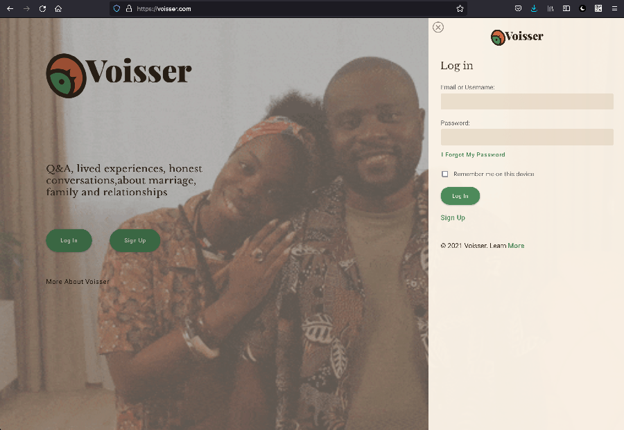
Voisser.com login/sign up screen
The Challenge
Voisser is built on an open source PHP/mySQL framework called Q2A. The core of the software itself is great, but the UI/UX design is dated and unintuitive. A few important features are also lacking.
My task involved reviewing and redesigning content and interface to achieve a simpler, clutter-free, and improved user-centred experience
The Process
I worked within a team using strategy, user insight and design iterations to craft a simpler and more useful content system for the platform. I also identified and fixed issues in the end-to-end user journey.
The new content system highlighted information that data and testing showed were most important to the users. The result was a distraction-free feed that provides users with the content they need when, and where they need it.
Some Research Findings
The current simple and clutter-free iteration of the design was influenced by what our user research showed.
82% of users, only cared about the following:
- Easily finding a Voiss (question) that interested them
- Easily finding a Voiss that they can respond to
- Easily finding out if a voiss that interests them, already has responses they can read
This information influenced the redesign of the home feed that has two main features:
- A clear concise list of available questions that users can easily run through and pick whichever interests them.
- The number of responses each question has, if any
Other details, like when a post was made, who posted it or the illustration used, were found to be unimportant to 74% of the users (at first contact). These extra details were still provided, but only available in an alternative view or when a user clicks on a Voiss to view its content.
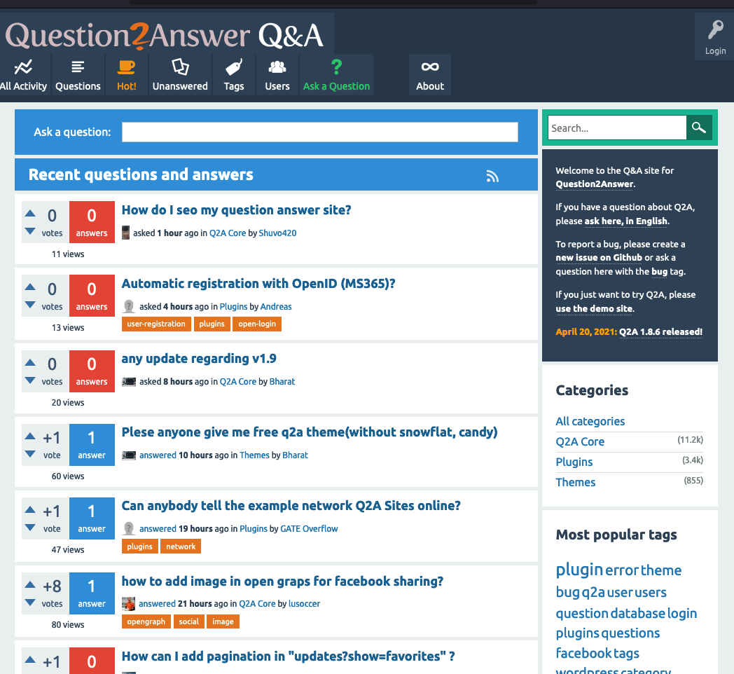
The default UI of Q2A, (the open source platform that Voisser is built on).
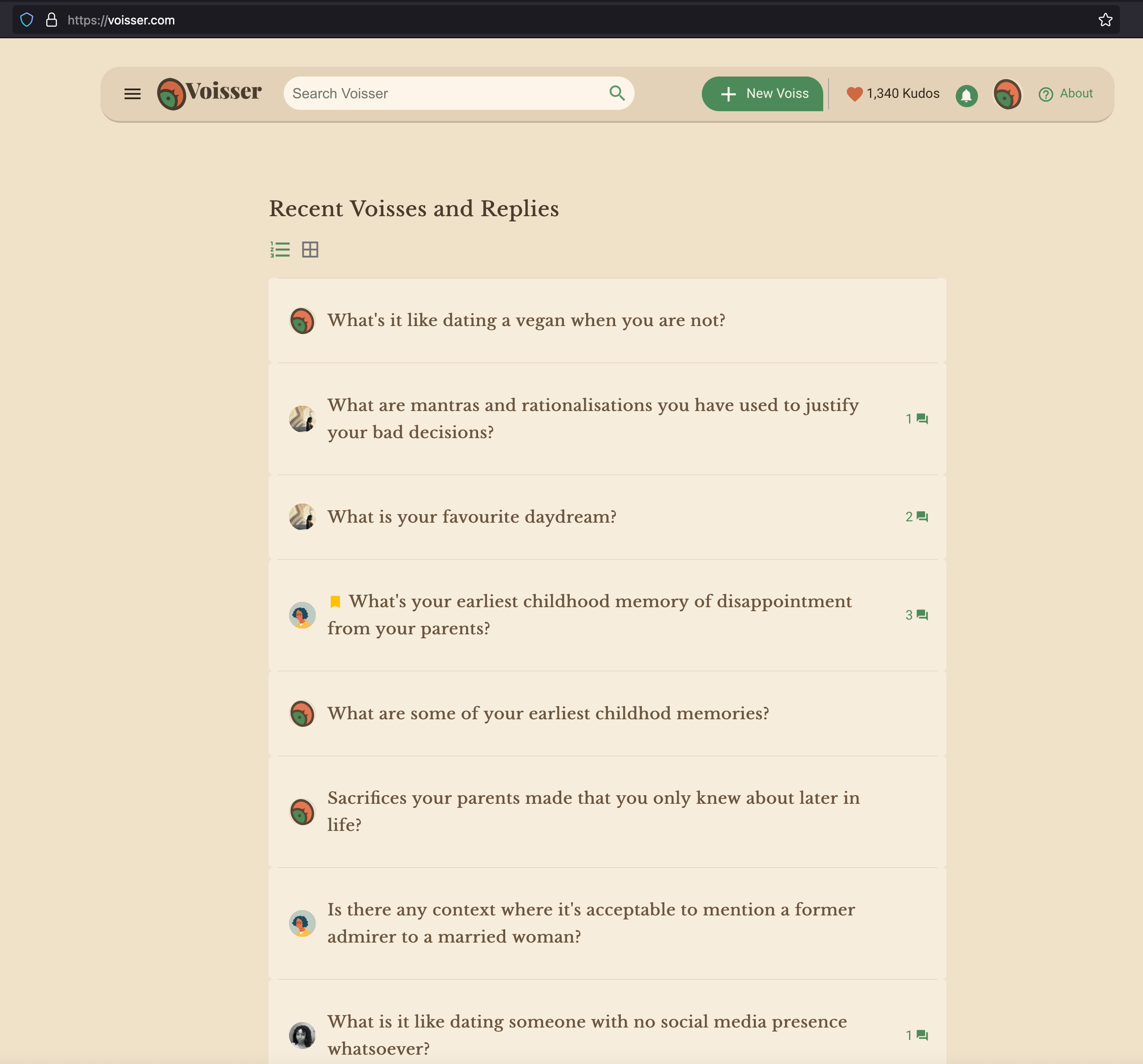
Voisser’s redesigned home page showing the clean, clutter-free content feed.
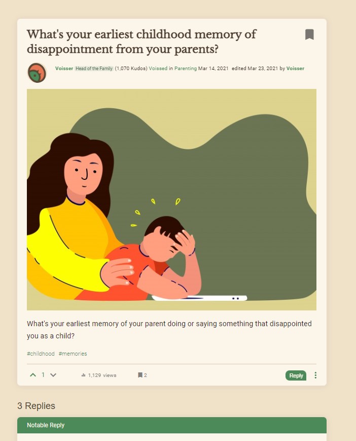
Question page showing a simple, user-focused design.
Privacy Concerns
Discovery showed that majority of users had concerns about sharing experiences that might embarrass them, while being useful to other users.
Another task I had was to design features that will make such users feel more comfortable sharing sensitive personal stories and experiences.
This was solved by developing a feature that allows such users to:
- Post questions and answers anonymously
- Control what questions or answers are visible on their public profile
A client concern was the potential for this feature to be abused. This was confirmed during testing.
The solution was to hide the feature from plain sight, such that it is only revealed when needed.
A feature was designed that allows users worried about privacy to post anonymously.
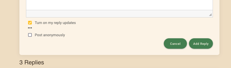
The ‘post anonymously’ feature is tucked away and only revealed when needed.
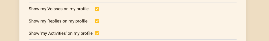
Users can change their privacy settings from their profile. This controls if their activities are visible to other users.
Summary of role and involvement
- Writing, testing and iterating UI copy
- Login/registration journey design
- Pair writing error messages, and user communication email templates
- I participated in user research and usability testing to discover user needs
- Navigation and new feature design for mobile and desktop
- UX writing, testing and improvement to make Voisser easy to use
- Used prototyping tools to design and iterate content